An interesting and large-scale project in collaboration with the KPK (Komisi Pemberantasan Korupsi) or Corruption Eradication Commission is in the form of a merchandise set. These merchandise items are used to promote an anti-corruption campaign to the public
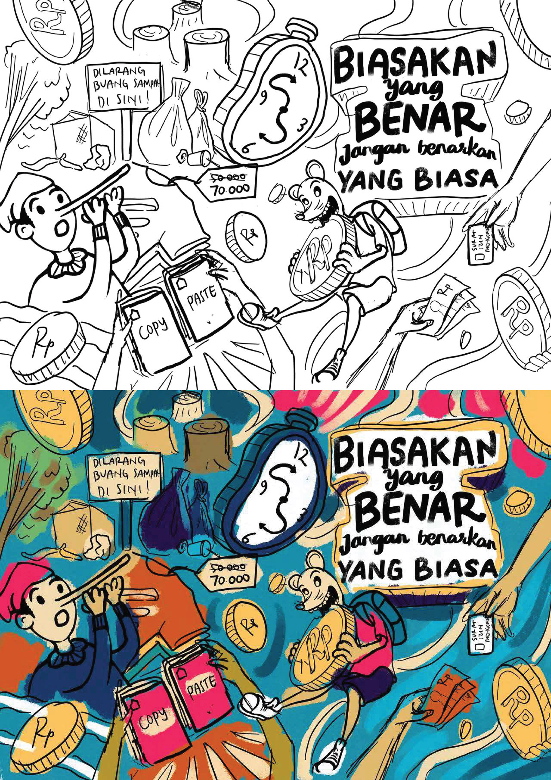
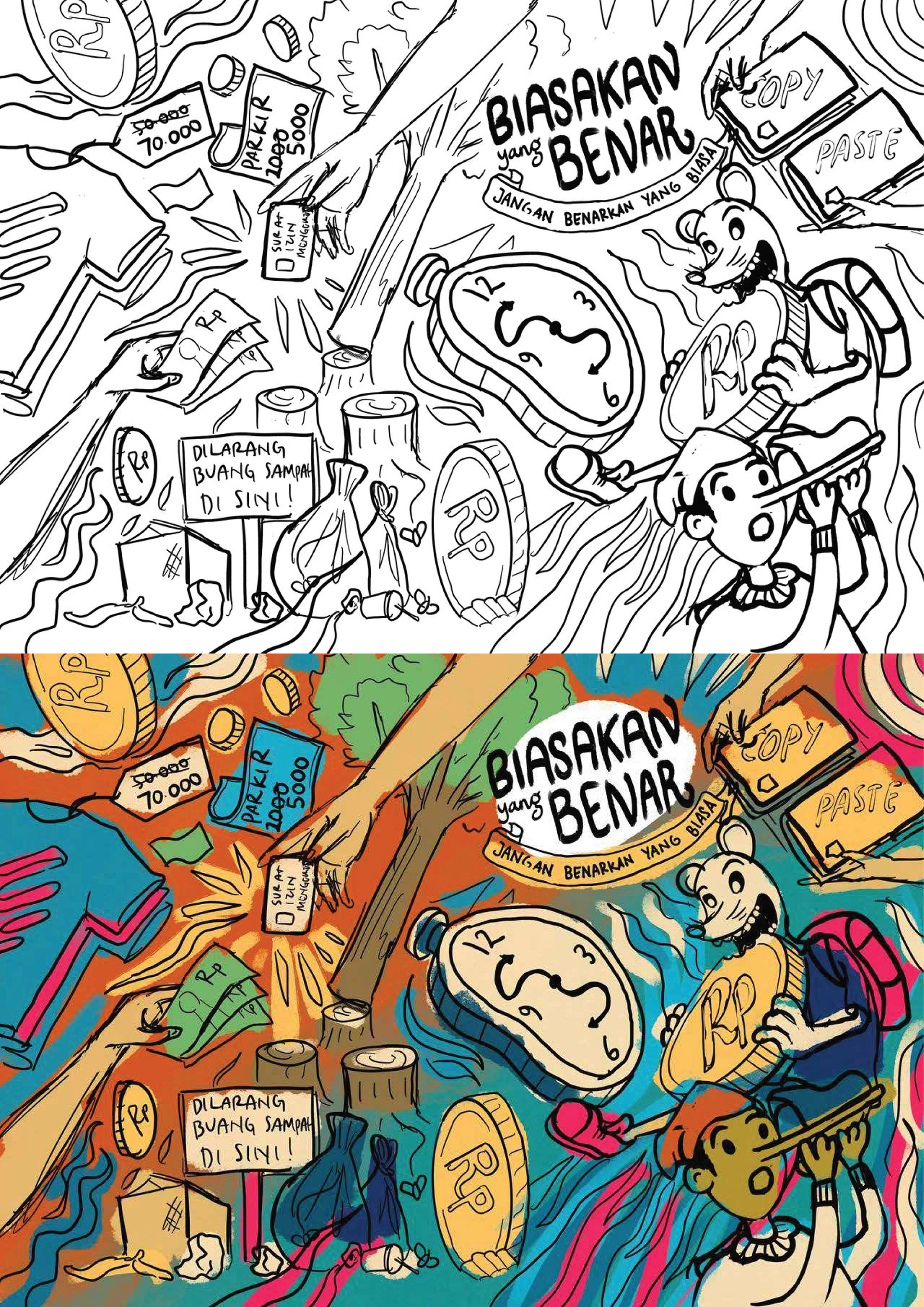
The campaign’s theme is Biasakan yang Benar, Jangan Benarkan yang Biasa (Get used to what is right, don’t justify the usual). It conveys the message that many of our normal habits can actually lead us to commit acts of corruption, even on a small scale. We should avoid getting used to this kind of petty corruption.
This theme was applied to eight types of merchandise items: notes, tumblers, tote bags, pouches, lanyards, id card holders, e-money card and stickers. Each item describes an example of petty corruption that we should avoid.
The Sketching Process
This creative process starts with making the main illustration. It will later be processed in such a way that it can be applied to various types and media of existing merchandise.
Below is an alternative to the initial sketch of the main illustration. Some of the objects in this initial sketch were then replaced and adjusted in the final version.


Application Process and Final Results
In order to apply the main illustration to different media, I experimented with taking some objects from the original image and rearranging them in a different way. This allowed me to create a new image that was more suitable for the shape and size of the merchandise that I wanted to use.
Blocknotes and totebag design
The blocknotes on the right display the entire design of the main illustration, while the tote bag uses a different approach. It takes only a few objects from the main illustration, rearranges them in a new way, and adds some extra elements to enhance the appearance. This results in a whole new image that is distinct from the original one. I also apply the same method in other medias below.
Tumbler and pouch design
ID card holder with lanyard, e-money card, and sticker set.
